Is it week 6 already?.........
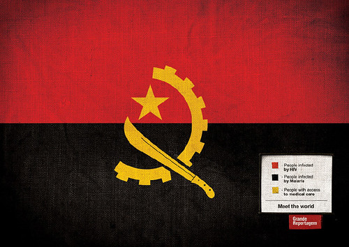
This was a campaign for Portuguese political magazine 'Grande Reportagem', by Lisbon design firm 'Foote Cone & Belding'.
They turned flags of various countries into infographics by adding information in a legend in each image.
Brazil:
Green - people who live on less than $10/mth
Yellow - people who live on less than $100/mth
Blue - people who live on less than $1000/mth
White - people who live on more than $100 000/mth
U.S.A:
Red: In favor of the war in Iraq
White: Against the war in Iraq
Blue: Don't know where Iraq is
The E.U:
Blue - petrol (gas) consumption
Yellow - petrol (gas) production
China:
Red - minors at 14 years old who work
Yellow - minors at 14 years old who study
Angola:
Red - people infected with HIV
Black - people infected with Malaria
Yellow - people with access to medicine
Columbia:
Red: Exportation of bananas
Blue: Exportation of coffee
Yellow: Exportation of cocaine
Somalia:
Blue - women who suffer genital mutilation
White - woman who don't suffer genital mutilatio
Burkina:
Red - people that die before age one
Green - people that die before age three
Yellow - people that reach adulthood
The legitimacy of these percentages has been questioned, or even proven wrong, on most sites and forums I've seen these. However, I do think the point of the campaign was to highlight very important issues.
I have seen other flag design done similarly but I think they aren't part of the campaign and weren't made by the FCB design group.
first discovered topic here.
http://www.newsdesigner.com/archives/002152.php


Those are some pretty clever infographics.
ReplyDeleteya but they're bogus
ReplyDelete